
📊- Chart Customization
Introducing the latest addition to Charts and Reports App, ‘The Chart Builder’!
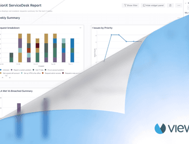
If you’re using Charts and Reports for Jira Service Management (Cloud), you now get to experience the newest feature, i.e., to have the ability to customize and group legends with the new Chart Builder. Customer requests are key-value points for us, and the new Chart Builder capabilities try to cover the chart customization features our customers have been requesting over the past months.
Let me walk you through the two new features to make it work for your organization.
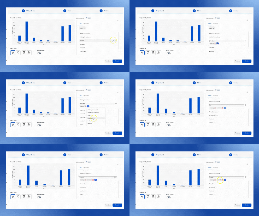
🧮 Grouping Legends in Chart Builder
When our App creates visuals, it aggregates your data into chunks (or groups) based on values found in the underlying data. Often that’s fine, but there may be times when you want to refine how those chunks are presented. For example, you might want to place three categories of products in one larger category (one group).
The new legend grouping feature of the Chart Builder helps you organize your visuals to clearly view, analyze, and explore data and trends.
🌈 Customize Colors
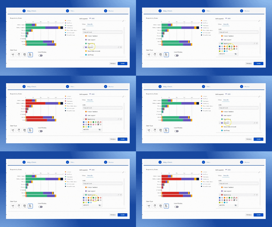
The Chart Builder now supports adding custom colors for legend groups. This has been a long pending feature request from our customers, and we are really glad to have it included in the new Chart Builder.
Now that you know about the new ‘Charts Builder’, how about you try it out for yourself! We would love to hear your thoughts and feedback about this new addition to the Charts and Reports App.
Try it for yourself at the
Atlassian Marketplace for free! ✨Product Guy
Social Media
PRODUCTS

